So you just created the next best web app. You know it has loads of potential, but it’s missing one thing… A responsive landing page! Well have no fear, after this blog you will have the perfect landing page for your latest creation.
First you will need a background image that is at least 1920p x 1080p. This size works best across different screen devices. I usually get my photos of unsplash.com as they have a very nice selection of high quality photos for just about anything you can think of. Once you have that done, the next thing is a blank html with just the basics and a css file. Like this:
<!doctype html>

<html lang="en">
<head>
  <meta charset="utf-8">
  <meta name="viewport" content="width=device-width, initial-scale=1,shrink-to-fit=no">
  <meta http-equiv="X-UA-Compatible" content="ie=edge">
  <link rel="stylesheet" href="css/styles.css?v=1.0">
	<title>Sweet Meats</title>
</head>

<body>


</body>
</html>
Inside the body tags we will add a header tag with our welcome message and any additional text we want to show our visitors.
 <header id='landing-splash'>
      <h1>Welcome to Meat Land!</h1>

      <p>Spicy jalapeno bacon ipsum dolor amet cupim ribeye ham, drumstick ball tip kevin    beef ribs salami chicken turkey pork belly fatback venison. </p>
			<a class="main app link" href="/meats">Click for Steak</a>
 </header>
Take note of the id attribute given to the header, this is important as it will be used later as a selector for css styling. Now that we have our welcome message, a short info text, and link to all the meats, it’s time for styling.
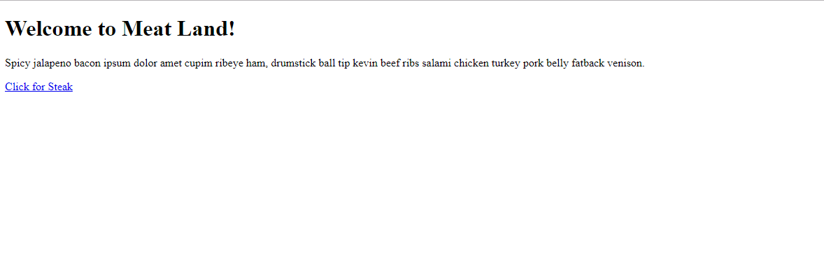
Before that, here is snapshot of my html page and file so far.
<!doctype html>

<html lang="en">
<head>
  <meta charset="utf-8">
  <meta name="viewport" content="width=device-width, initial-scale=1,shrink-to-fit=no">
  <meta http-equiv="X-UA-Compatible" content="ie=edge">
  <link rel="stylesheet" href="css/styles.css?v=1.0">
	<title>Sweet Meats</title>
</head>

<body>

   <header id='landing-splash'>
      <h1>Welcome to Meat Land!</h1>

      <p>Lorem Ipsum spicy jalapeno bacon ipsum dolor amet cupim ribeye ham, drumstick ball tip kevin    beef ribs salami chicken turkey pork belly fatback venison. </p>
			<a id="main-app-link" href="/meats">Click for Steak</a>
 </header>

</body>
</html>

Now for the styling, let’s get some ground work done for the font and margin.
*{
margin:0;
padding:0;
}
body{
  margin: 0;
	font-family:  "Georgia", "Arial", sans-serif;
	font-size: 20px;
  line-height:1.5;
}
Here we used the * selector to reset the default margin and padding of our page elements. You might also want to add color that matches the theme of your photo.
The id selector of the header is used to add a background image.
#landing-splash{
  background-image: url('../images/steak.jpeg');
	background-size:cover;
  background-position:center;
	height: 100vh;
}
With the styling above we have pretty much done about 90% of what makes a landing page a landing page. We have our link to the background image. It is set to ‘cover’ and ‘centered’ so that the entire image is displayed. The ‘vh’ unit uses the height of device that is being used to view the page. Meaning a vh of 50 will cover 50% of any screen.
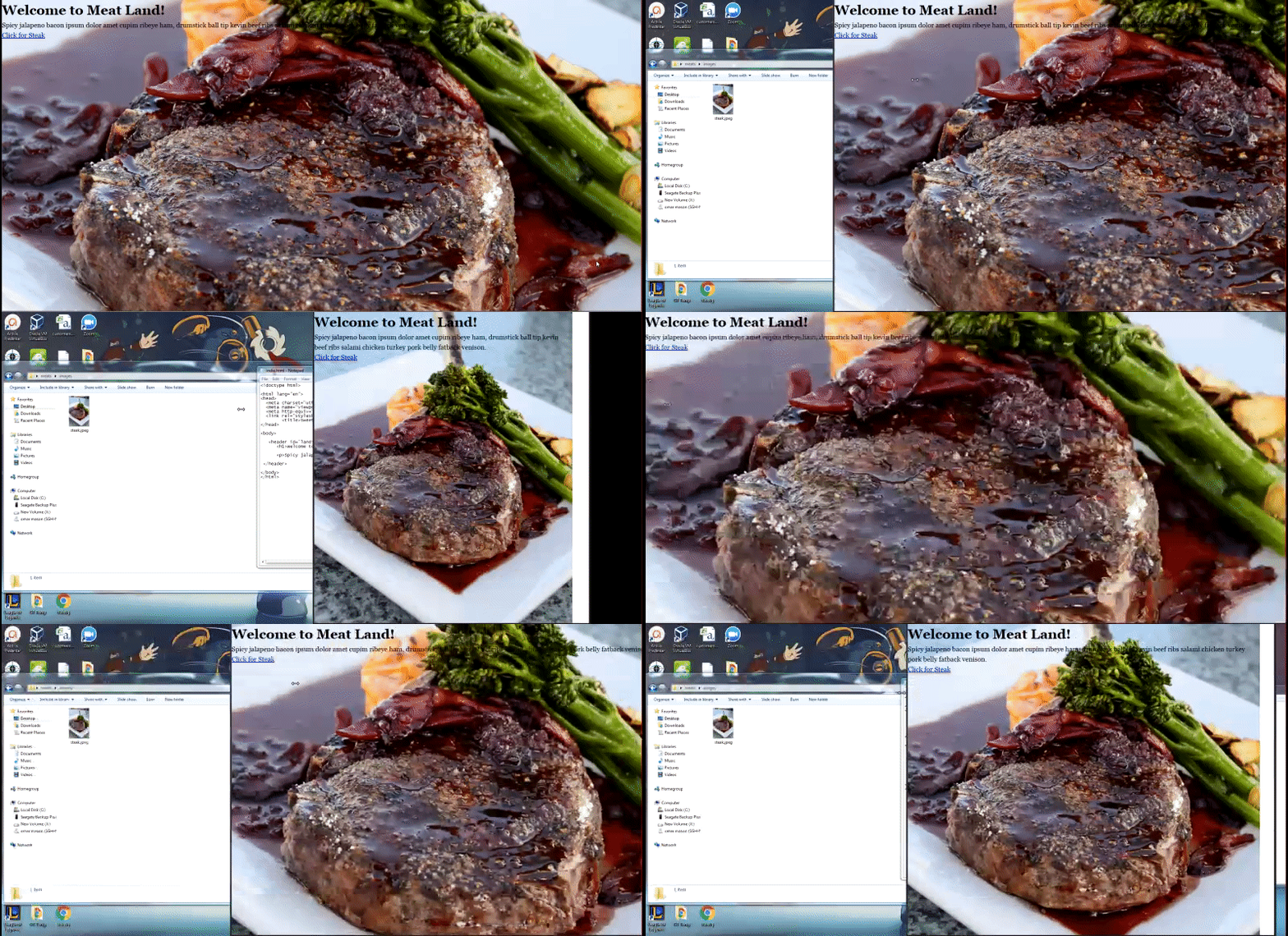
Here is what we have so far:

The background image is nice and responsive, but the text seems out of place and unresponsive. Let’s fix that.
#landing-splash{
  background-image: url('../images/steak.jpeg');
	background-size:cover;
  background-position:center;
	height: 100vh;

  display:flex;
  flex-direction:column;
  justify-content:center;
  align-items:center;
	padding: 0 20px 0 20px;
}
Using flexbox makes this an easy task as you won’t have to worry about float interactions. Flexbox also makes ordering and positioning of child elements a breeze. To utilize flexbox we set our element to display flex. The default positioning of child elements for flex is side by side so we adjust by setting the derection to column. The following two lines centers our welcome message on the page. The last line adds space around our content so that it is not right up against the edge on smaller devices.
The text is a little difficult to read against the bright back ground so let’s fix that.
body{
  margin: 0;
  font-family:  "Georgia", "Arial", sans-serif;
  font-size: 20px;
  line-height:1.5;
  color: #912704;
  text-shadow: 1px 1px 1px #000;
}

#landing-splash{
  background-image: linear-gradient( rgba(0, 0, 0, 0.7), rgba(0, 0, 0, 0.2) ), url('../images/steak.jpeg');
  height: 100vh;
  background-size:cover;
  background-position:center;
  display:flex;
  flex-direction:column;
  justify-content:center;
  align-items:center;
  text-align:center;
  padding: 0 20px 0 20px;
}
First thing changed here is the color of the text; black text on a multicolor bright background can put a lot of strain on the eyes. The addition of a subtle text shadow helps to add definition to our welcome message. Next we add a linear gradient to dim the background for more emphasis on our text. These numbers can be adjusted to better suit the background you are using.
Now this looks great so far and it’s very responsive but there is more we can do to let the text standout and style that link to look more clickable. Let’s start by styling the text content.
#landing-splash h1{
  font-size:50px;
  line-height:1.2p;
}

#landing-splash p{
  font-size:18px;
}
The increase in font size is one of the easiest and most natural ways to draw more attention to text.
Now, on to the main content link.
#landing-splash .main-app-link{
  font-size:18px;
  text-decoration:none;
  color: #912704;
  border: #912704 1px solid;
  padding:10px 20px;
  border-radius:10px;
  margin-top:18px;
}

#landing-splash .main-app-link:hover{
  background: #912704;
  color:#fff;
}
There is a lot going on here so let’s break it down line by line. The first line increases the font so that it is consistent with the rest of the text on the page. The removal of the underline text decoration and addition of the brown color also adds to making the link match up with the text around it. At this point the link is indistinguishable from the from the paragraph text above it. The addition of a border makes the link look more clickable. We use padding to increase the size of the newly created button. The current trend in technology is adding curves to everything so we’ll follow along and remove the pointed corners from our button. A top margin helps to add some space from our paragraph.
The remaining code adds a change in background and text color to the button, signaling to the user that they can interact with this button.
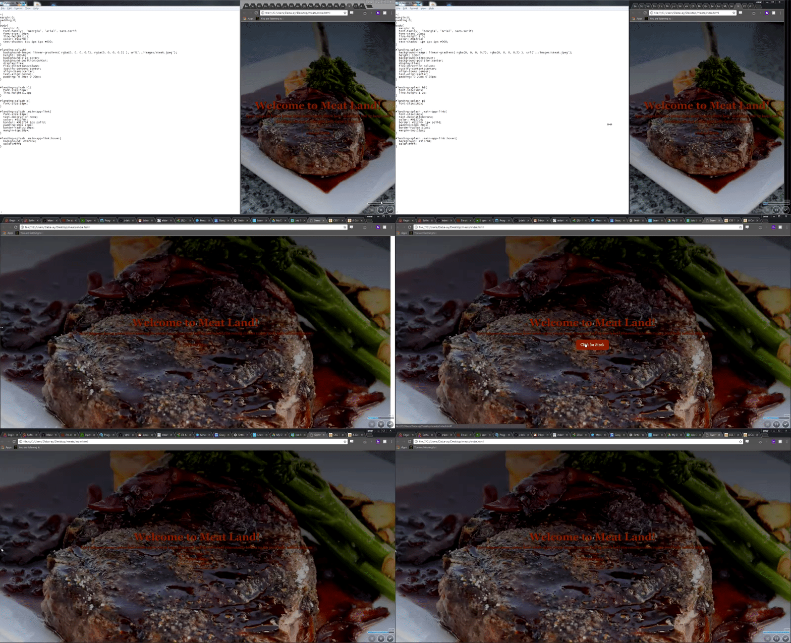
Here is look at the final product:

Hopefully you found this helpful and you like the new look of you responsize landing page!
Sources:
Flexbox guide: https://css-tricks.com/snippets/css/a-guide-to-flexbox/ Web tips and tricks: http://www.traversymedia.com